
INTRODUCTION
ABBOTSFORD
COMMUNITY
BRANDING
Abbartsforward is a creative and innovative approach to city wayfinding that aims to integrate art into urban landscapes. The inspiration for this project came from the city of Abbotsford's 200k Plan for the remodeling of the city centre. By partnering with local artists, photographers, painters, and designers in seasonal campaigns, Abbartsforward aims to enhance the navigational aspects of the city centre and provide a platform for local creators to showcase their work. This not only creates an engaging environment for residents and visitors but also supports the local creatives in the community. Abbartsforward's approach is a unique and exciting way to build a modern urban core that reflects the city's identity and values.
SERVICE
Branding, Wayfinding, Advertising,
Print Publication, Non-Profit
CLIENT
N/a
YEAR
2022
GRAPHIC DESIGN PROCESS
The colour palette of our brand has a meaningful purpose—each colour was carefully selected to represent the unique aspects of our community: nature, berries, and ambitions. Our green colour was inspired by the blend of nature and the Fraser River that flows near us. Pink represents the stain left behind on your fingertips after eating fresh berries, and purple highlights our community's ambitions.


BRANDING
I recognize that this brand requires plenty of attention to detail in order to effectively manage the many variable factors involved with the artwork. From art submissions to signage locations, printing, and fabrication, every aspect of our brand must be carefully considered and standardized to ensure accuracy and consistency. That's why I've developed an in-depth brand guide, that outlines specific formatting requirements, dimensions, and printing specifications to guide our partners and collaborators. This comprehensive brand guide can ensure that the brand is showcased well and highlights our communities values.
ABBOTSFORD MAPS


ABBOTSFORD
STREET BANNERS
Branded street banners provide a versatile platform for showcasing our unique elements, whether it be through illustrations, photography, or way-finding. With the ability to be displayed in both low and high-hanging placements, our street banners offer a range of options for promoting our brand throughout the city.
Historic Images Sourced From:
Vancouver Archives AM1535-: CVA 99 - 3260

ABBOTSFORD
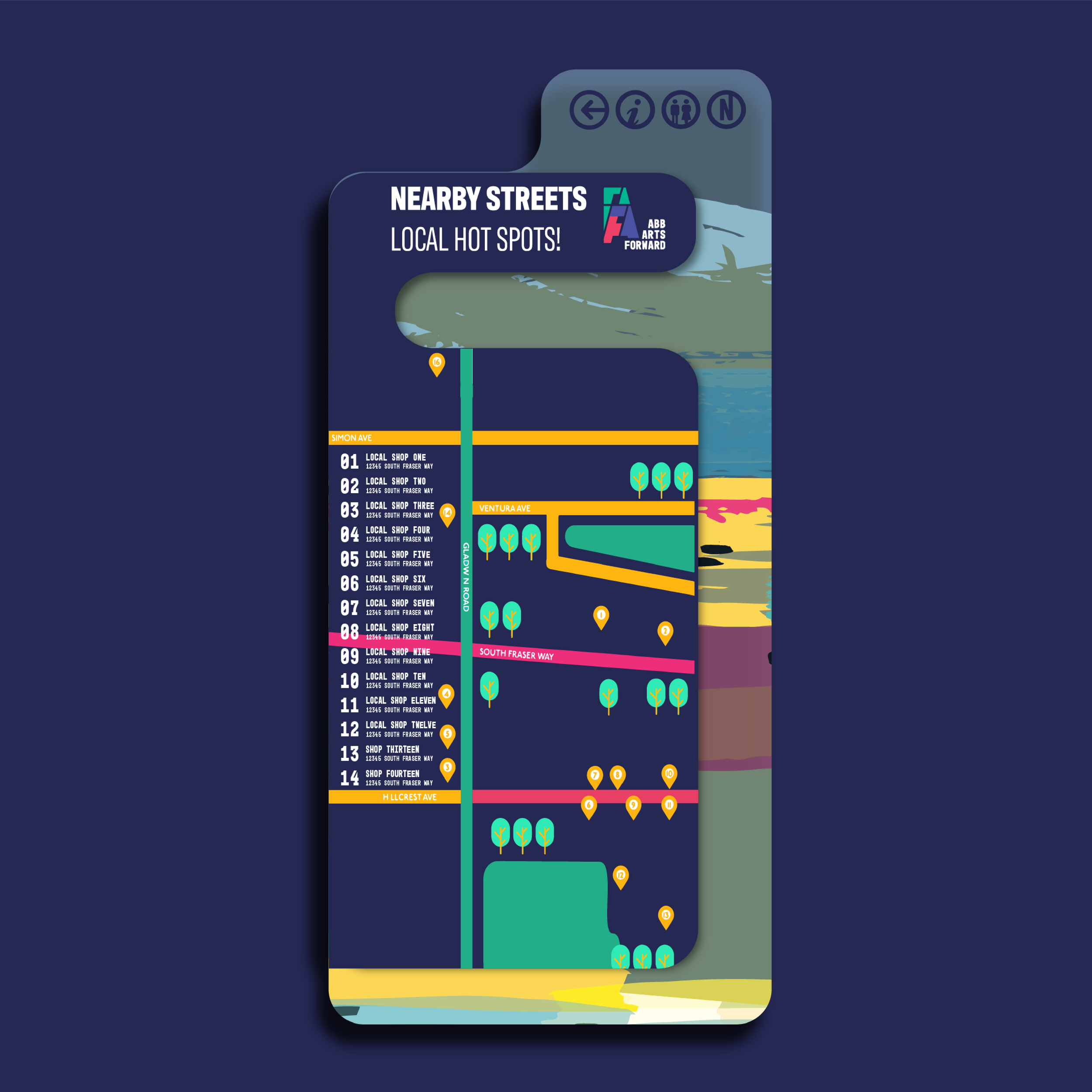
STREET NAVIGATION
The district maps serve as a valuable tool for members of the community aimed to help navigate the new city centre. Whether you're looking for local shops, restaurants, bakeries, parks, or activities, the district maps provide detailed information to help you find what you need. What's more, these maps are designed to highlight the unique identity of our community, featuring community-created art that complements our branding. By integrating art and information, district maps promote our community's culture and enhance the experience of the city.

ICONOGRAPHY INFLUENCED STREET MARKERS TO AID IN QUICK NAVIGATION, ACCESSIBILITY, AND ENGAGEMENT.


ABBOTSFORD
TRANSIT SIGNAGE

I’ve also included a map in our logo. The map depicts South Fraser Way intersecting with Gladwin Road, with an empty square at the top representing our desired location. Our logo is designed to be read in a specific order to convey the three key aspects of our brand:


WEBSITE & SOCIALS
The website serves as a central hub for all things AbbArtsForward, featuring blog content, way-finding tools, digital maps, and submission forms for artwork. As an organization focused on working collaboratively with our community, the website is a platform for positive change in the environment. Through our website, community members can easily submit their artwork, photography, and other creative art for display. By showcasing a diverse range of local talent, we aim to celebrate and promote the vibrant arts and culture scene in Abbotsford.

With plenty of changes coming from the 200K Plan, it can be expected to feel uncertain. That's why we're committed to implementing art throughout our city as a way to connect it back to the community. By fostering positive engagement and celebrating our rich culture of art, we aim to enhance the quality of life in Abbotsford.
We have the opportunity to create a sleek and enjoyable way-finding system using directional lines influenced by railway system diagrams. With directional cues on sidewalks, we can help pedestrians navigate through high-congestion areas or find their way to local facilities.
Artwork can be contracted to local artists;
For this project, let’s say I was “contracted” to create background art for this season’s campaign.

